· 18 min read
The Groan Beneath the Song
On the Sunday school lie that split sacred from secular, the Psalms that broke it, and the song that met me when I couldn’t pray.
Read →
This guide governs the full Dexter Jakes brand across every surface: imjustdex.com (editorial site), social carousels, post graphics, story formats, presentation decks, print, merch, signage, motion, and any future medium. It is not an aspirational document — it is the operating system.
What this document controls: logo usage, color, typography, component design, editorial voice, microcopy, structural rules, social templates, platform adaptation, accessibility, responsive behavior, interaction states, and motion. If a decision is not addressed here, it defaults to the nearest existing rule — not to the designer’s preference.
What this document does not control: content strategy, publishing cadence, topic selection, audience targeting, or third-party platform UI the brand cannot modify. Those are editorial and operational decisions, not design-system decisions.
Enforcement principle: this system should not require taste to apply correctly. If an implementer follows every rule here and produces something that looks wrong, the document is incomplete — not the implementer. File the gap. Update the guide.
Dogfood rule. The /brand page runs the same tokens.css, shell.css, plates.css, home-augment.css, and article.css as the live site. Component demos below Section 13 render production classes directly — not guide clones. If a live component breaks, this page breaks too. That is intentional.
The Dexter Jakes monogram — “DX” — set in False Regular. Two letters, no tagline, no explanation. The mark carries the same weight as the writing: dense, architectural, unapologetic.
<img> with data-base="/img/" — mode.js rewrites the src between logo-dark.svg and logo-white.svg at the class flip.SVG · PDF · PNG (512 / 1024 / 2048 / 4096 px) — black (#050505) and white (#f4f4f1) variants. Google Drive.
Two authored modes. Light and dark are not audience-facing moods — they are editorial decisions. The mode toggle in the masthead above is the real, production mode toggle: a cookie-persisted user preference that controls every page on imjustdex.com. Flip it and watch the site respond. It is the same control served to every reader, not a preview.
Policy: no color may be introduced outside this palette. No opacity values may be created ad hoc — use only the defined alpha variants. Dark mode is a complete variable inversion, not a filter or overlay. Never mix light and dark elements on the same surface. If a new token is needed, it is added to tokens.css first — not in a component stylesheet.
Red marks editorial emphasis. Never decoration. It is the only color outside the monochrome palette, and its scarcity is what gives it power. Accent is for signal, not garnish. The moment red becomes frequent, it becomes invisible.
Hard limits. Maximum 1–2 accent moments per viewport on any surface. Maximum 4 per full article page across all scroll positions. Maximum 2 per carousel slide. If you are debating whether something needs red, it does not. Red is earned by function: section structure, scripture citation, callout emphasis, focus rings, and plate hover borders. Nothing else.
Background prohibition. Red is never used as a background fill on any surface — no red panels, no red cards, no red banners. The only exception is the on-accent logo colorway (white mark on red ground), which is a brand-mark context, not a layout context. If it fills more than a 3px line or a single text span, it has gone too far.
Stacking prohibition. No more than one red-led component may appear in the same module or viewport region unless the layout is intentionally designated as a high-emphasis moment (e.g., a section head directly above a scripture block). Two accent elements side by side is a signal. Three is noise.
Cross-surface rule. #c00 is the only red permitted on any DX surface — site, carousel, deck, print, merch, motion. Never warm it, never cool it, never lighten it, never use it at reduced opacity except where the system explicitly defines an alpha variant.
One structural red, both modes. --accent holds at #c00 in light and dark — same value, zero flip. WCAG non-text contrast (borders, fills, underlines, large display text) only requires 3:1, and #c00 on #060606 clears at 3.45:1. Every structural consumer of red — section rules, callout borders, scripture cites, plate hover borders, focus rings — stays on #c00 in both modes.
The small-text exception. AA normal text requires 4.5:1, which #c00 does not clear on #060606. A second token, --accent-text, handles this: #c00 in light, #ff4d4d in dark (7.54:1, AAA). Reserved for text-tier consumers only — inline link hover, uppercase micro-labels, sub-18px metadata, callout emphasis spans, scripture citation text. If the element is a line, fill, or border, it uses --accent. If it is readable type under 18px, it uses --accent-text.
Three distinct typographic layers. They do not overlap. Each has a single job and a hard boundary.
Typeface: False Regular. Used exclusively for the DX monogram. Never substituted, never approximated, never set in any other weight. The mark is always delivered as outlined SVG paths — the font file is a source asset, not a runtime dependency. No surface should ever require False Regular to be installed.
Two web fonts, surgically applied. Anton (self-hosted WOFF2) is the loaded display typeface — Impact and Haettenschweiler remain as system-native fallbacks in the stack. IBM Plex Sans (self-hosted WOFF2) is the body typeface. IBM Plex Sans Italic is self-hosted as a fourth file — the body sets font-synthesis: none site-wide, so faked italics are impossible. No Google Fonts dependency — every font is served from /fonts/.
The Structure Is the Beauty
Every decision — border weight, title scale, metadata format, accent placement — exists to make every surface feel printed, rigid, and inevitable. If a change makes any artifact feel more like “content” and less like a “publication,” the change is wrong.
The mechanical layer. Metadata, navigation, tags, labels, eyebrows, slide numbers. Always uppercase, always monospaced or narrow. Never draws attention to itself — it stamps and recedes.
Faith · Identity · Work · Grief · 8 Min · Apr 19, 2026
No highlight reel. Just the full human, documented.
Every distinct tracking value on a brand surface earns its own token. No consolidation. At uppercase chrome sizes, a .03em delta is visibly perceptible side-by-side — collapsing near-neighbors would introduce drift on every tag chip, meta rail, and chrome label in the system.
Two directions, one doctrine. Negative tracking (--track-display, --track-title) is display-tier only — tight letterforms at h1, plate title, pull-quote scale read as editorial confidence. Never applied below 18px. Positive tracking (--track-brand through --track-eyebrow) is chrome and uppercase: the wider the tracking, the smaller and more label-like the element. Tiny eyebrows get .22em. Brand wordmark gets a restrained .03em.
--track-display −.03em · h1, plate titles, stat block, 404 headline
--track-title −.02em · pull-quote, nav title, identity tagline
--track-brand .03em · brand mark / wordmark only
--track-nav .04em · mode toggle, eyebrow date
--track-footer .06em · footer-strip items
--track-badge .08em · meta-rail, identity-sub, 404 actions
--track-chrome .1em · article meta, back button, share bar
--track-tag .12em · tag chip, stat microlabel, nav label
--track-teaser .14em · identity meta-rail, teaser date
--track-label .15em · section heads, scripture cite, CTA
--track-indicator .18em · section indicator (fixed mark)
--track-eyebrow .22em · 404 eyebrow (widest on the system)
Rule: every letter-spacing declaration in production CSS points at a --track-* token. Zero exceptions. Raw values are drift.
Font-weight is tokenized as a binary: regular and bold. No intermediate weights. The brand uses exactly two — 400 for all body and display type, 700 for all chrome, labels, tags, and strong emphasis. No medium, semibold, or black.
--weight-regular 400 · body, display, drop caps, article copy
--weight-bold 700 · chrome, labels, tags, strong emphasis
Why binary? The tokens earn their keep by making the binary legible at the call site. var(--weight-bold) tells you the element belongs to the chrome vocabulary; 700 does not. A medium or semibold intermediate would dilute the hierarchy — the system’s whole visual logic depends on the gap between the two.
Exception: @font-face declarations hold raw 400 / 700 values because CSS custom properties do not resolve inside @font-face at-rules. This is a language constraint, not a drift.
Every font-size in production CSS points at a semantic alias. The scale is a two-tier system: --size-1 through --size-19 hold raw rem and clamp() values; --text-* aliases give the call site its intent. Consumers declare what they are, not how big they are.
Why 19 steps and not 7. A modular scale would force every existing size to round up or down, breaking calibration tuned by eye across months of editorial work. Phase 5 clustered the 42+ raw values found in production CSS and snapped near-neighbors only where differences sat below the perception threshold (sub-pixel noise: .7rem ≈ .72rem, .8rem ≈ .82rem). Display sizes preserve every distinct clamp() — those were tuned with editorial intent and collapsing them would visibly shift the site.
--text-meta .6rem · meta rail
--text-micro .72rem · micro label
--text-label .75rem · chip / eyebrow
--text-citation .82rem · scripture citation
--text-nav .88rem · nav chrome
--text-chrome .92rem · chrome-md — buttons, share bar
--text-body 1rem · article body base
--text-lede 1.08rem · article lede
--text-quote 1.15rem · pull-quote base
--text-h3 clamp(1.2rem, 2vw, 1.6rem) · article h3, nav title
--text-tagline clamp(1.35rem, 2.4vw, 2.4rem) · identity tagline
--text-h2 clamp(1.6rem, 4vw, 2.4rem) · pull quote, section h2
--text-stat clamp(1.6rem, 5vw, 2.6rem) · stat block
--text-plate clamp(2rem, 4vw, 4rem) · plate-title base
--text-plate-med clamp(2.35rem, 5vw, 5rem) · plate-title medium
--text-h1 clamp(2.8rem, 7vw, 5rem) · article h1
--text-display clamp(3rem, 10vw, 9rem) · 404 display
--text-plate-lg clamp(3.5rem, 7vw, 7.2rem) · plate-title large
--text-identity clamp(3.8rem, 10vw, 7.5rem) · identity name
Rule: every font-size declaration in production CSS points at a --text-* token. Consumers never reach past the alias to the primitive. If a new size is needed, add a primitive slot — do not inline a raw rem.
Five resolved leading values cover every surface on the brand. Display-tier headlines ride .86; pull quotes and h2/h3 ride 1.05; chrome rides 1.4; article body rides 1.7; the article lede rides 1.85. Anything outside this ladder is an editorial exception documented at the call site (drop cap multipliers, badge-style line-height: 1, the identity name’s .82).
--lh-display .86 · headlines, plate mega, 404
--lh-tight 1.05 · h2, h3, pull quote
--lh-snug 1.4 · chrome, nav, meta
--lh-normal 1.7 · article body
--lh-loose 1.85 · article lede
12-column CSS grid. Rows must sum to 12. Adjacent plates must never share the same background treatment — textures and plain surfaces alternate so every card contrasts its neighbor.
Policy. Plates are the homepage architecture. They are not cards, not tiles, not thumbnails. Every plate is a self-contained unit with a title, metadata, and a texture or color fill. Plates never contain body text, images of people, or calls to action. Plate borders are 3px solid — never reduced. Hover state: border shifts to var(--accent) plus a subtle scale. On mobile plates stack single-column but retain full border, texture, and typography. A plate that loses its structure on any breakpoint is a broken plate.
Plate variants. .plate-lead is the issue-opener — split body over image, latest-badge, lead-rail. Documented in full in Section 17. .plate-wide spans the row at plate-med scale. .plate-secondary is the three-up row cell. .plate-banner is a wide image-forward card. .plate-row is a modifier that drops the cell into a row layout (title + deck + meta rail on one line) for archive-density moments — see the Reckonings card at the bottom of the homepage.
Semantic rule. Every plate is a single block-level anchor — the whole card is the link. There are no nested focusable elements, no absolutely-positioned overlay links, no <article> wrappers with a separate <a> inside. The card’s semantics, its focus ring, and its hover state all live on one element. Non-negotiable for accessibility and predictable tab order.
Image plates stay dark in both modes. The grayscale filter and black-to-transparent gradient on image plates hold identically in light and dark. There is no invert(1) flip and no mirrored gradient. One visual field, both modes. Image plates never lighten.
Dexter Jakes
The Groan Beneath the Song
The Nets Were Already Full
img-concrete
img-noise
img-lines
Italics are a real font, not a synthesized slant. IBMPlexSans-Italic.woff2 is preloaded alongside regular and bold. body { font-synthesis: none } is set site-wide — if the italic file fails to load, the browser falls back to upright text rather than producing a faked oblique. Scripture blocks, editorial emphasis inside body copy, and the rare titling italic all resolve to the authored file. Never set font-style: italic on a font that has no italic variant authored (Anton does not — never italicize display).
“For we know that the whole creation groaneth and travaileth in pain together until now.”
The net didn’t break because of the fish. It broke because they tried to carry the blessing alone.
If your grace only extends to people whose Christ-brand enhances yours, it was never grace. It was partnership.
And he said to them, “Follow me, and I will make you fishers of men.”
Matthew 4:19 (ESV)Stamped editorial mark. The indicator reads as a printed stamp, not a floating tooltip. No border-radius, no box-shadow, no hairline — just a content-weight hard border on var(--ink). An earlier pattern used a 1px rule + radius + shadow, which made it feel like a JavaScript chip hovering over the text. Pulled in favor of the stamp.
The psalms of lament are the longest category in the psalter — more than the praise songs, more than the thanksgiving. That ratio alone is a doctrinal statement: the worship of Israel expected the worshipper to bring their grief, not leave it at the door. Psalm 88 never resolves. It ends in the dark. That the ancient liturgy included a prayer with no happy ending is the whole point — the full in-depth treatment is hosted in the essay itself (see The Groan Beneath the Song). The demo you’re reading is a shortened preview of the component’s behavior.
Pull Quote. Purpose: arrest the scroll, surface the single line that reframes the argument. Max 2 per article, max 1 per carousel. Never adjacent to a callout or stat block. Never within the first 300 words. Placement: between major sections, never opening or closing.
Callout. Purpose: editorial aside or reframing statement. Max 2 per article. Never adjacent to another callout or a pull quote. Never in the first paragraph. Must contain at least one emphasis span if making a pointed claim.
Scripture Block. Purpose: primary textual anchor. Max 3 per article, 1 per carousel slide. Never adjacent to another scripture block. Always includes book, chapter:verse, and translation abbreviation. Never paraphrased — exact text only.
Stat Block. Purpose: typographic emphasis on a single data point or declarative statement. Max 2 per article. Never adjacent to a pull quote. Never used for opinions — only verifiable claims or theological declarations.
Research CTA. Purpose: link to backing study or source material. Max 1 per article, always after the final section. Never mid-article. Never decorative — only appears when a real study exists.
Study Note. Purpose: collapsed footnote surfacing translation, historical, or cross-reference context without disrupting the reading flow. Pattern: <details class="study-note"> with a <summary> label and a body. Appears under the scripture block it annotates. No limit, but use sparingly — only when the context genuinely changes the reading. Closed by default. Keyboard-expandable (Enter / Space).
Ghost Teaser. Purpose: pre-launch placeholder. Only on homepage plates. Never on article pages. Removed the moment the article publishes.
Meta Rail + Tags. Purpose: classification and reading metadata. Always present. Tags are single-word categorical labels from the approved vocabulary. Never more than 3 tags per article. Read time is always shown.
Section Head. Purpose: structural division of the argument. Always numbered (Roman numerals). Always accompanied by the red rule line. Never skipped — every section gets one. Never nested. One level of hierarchy only.
Prohibited Pairings. Pull quote + callout in the same viewport. Two scripture blocks within 200 words of each other. Stat block immediately following a pull quote. Any ornamental component used without editorial purpose.
Responsive Behavior by Component. Pull quotes: full-width within the article frame at all breakpoints; font-size scales via clamp() but never below 1.4rem. Callouts: left border and padding unchanged; text reflows naturally. Scripture blocks: maintain 2px left border; citation wraps below verse text below 480px. Stat blocks: bar + text remain side by side above 480px; stack vertically below. Meta rail: items wrap; never truncated. Tags: always visible, never collapsed into a “more” dropdown. Ghost teasers: maintain full structure at all widths; title scales down but never hides. Study note: summary wraps onto 2 lines if needed; body reflows with the article frame.
The writing voice is Poetic Brutalism + Dry Humor. Like brutalist architecture: raw material, no ornamentation, the structure is the beauty. Every word is load-bearing. The humor creates breathing room. Neither works without the other. The brutalism without humor becomes a sermon. The humor without brutalism becomes a podcast.
Policy: this voice governs all authored text across the brand — articles, captions, carousels, deck copy, email subject lines, and any surface where DX speaks in first person. The voice does not soften for social. It does not formalize for decks. It does not simplify for wider audiences. If the reader cannot handle the register, they are not the audience. Ghostwritten or collaborative copy must pass through this filter before publishing. No exclamation points. No rhetorical questions used as engagement bait. No hashtag-driven language. No emoji in body text. Humor is dry, never self-deprecating. Vulnerability is precise, never performed.
A gathered, called-out, living community.
Not a building. Not a brand. Not a broadcast.
Nobody told me that in Sunday school.
We lost the pregnancy. Just over four weeks. Early enough for some people to minimize it. But there is no “barely” in loss. There is only before and after.
I held his hand and begged God not to take him. I told Him I still needed my dad. Not as Bishop. Not as a leader. Just as my father.
All language — on-screen, on-slide, in print — follows one register: terse, stamped, authored. No articles or prepositions in labels. No verbs in metadata. No friendliness. The brand does not greet. It presents.
“8 min” — not “Takes 8 minutes to read.”
“Mode: Light” — not “Switch to dark mode.”
“Est. 1994” — not “Established in 1994.”
“Publishing Apr 19” — not “Coming soon on April 19th!”
Tags are classification, not decoration. Single-word categorical labels. Never cute. Never clever. Permitted vocabulary: Faith, Identity, Work, Grief, Inheritance, Language, Calling, Strategy.
Policy: The border system is the skeleton of the brand. It is not decorative. Borders define hierarchy, separate modules, and signal structural intent. If a surface has no border, it is either background or it is wrong. Border weights are never improvised — use only the two approved weights below. These rules apply identically across site, carousels, decks, and print.
3px solid var(--border) — primary structural borders. Plate outlines, article header, article body, share bar, pull quote top/bottom, section head rule, callout left border, carousel slide-inner frame.
2px solid var(--border) — secondary borders. Tags, meta rail edges, scripture blocks, brand block, mode toggle, footer items, back button, logo card labels, eyebrow rules on carousels (1px exception for eyebrow accent rule).
46px repeating grid lines at var(--rule) opacity on every background surface — pages, slides, print layouts, deck backgrounds. Non-negotiable. Never scaled, never recolored, never removed for “cleaner” layouts.
Rulers: Fixed-position decorative rulers (.ruler-top, .ruler-left) on all web pages. Hidden on mobile. Not present on social or print — the grid lines carry that function instead.
Article frame: max-width 680px. All articles self-contained HTML with shared production CSS. No inline styles in body copy. This constraint extends to any long-form reading surface — Substack, email newsletters, or any future publishing channel.
Every padding, margin, and gap on a brand surface points at a --space-* token. Ten slots, no improvisation. Like the type scale, spacing snaps to natural editorial steps rather than a rigid modular ramp — the ladder maps to actual component needs, not geometric progression.
--space-0 0 · zero-reset
--space-hairline 4px · icon gutters, tiny offsets
--space-xs 8px · tight internal padding
--space-sm 12px · standard internal, grid gaps
--space-chrome 14px · chrome tier — buttons, share bar, meta rails
--space-md 16px · primary component padding
--space-lg 24px · generous component padding
--space-xl 32px · block gaps
--space-2xl 48px · section gaps, closing block
--space-3xl 80px · page rhythm, article bottom
Rule: if a component needs a value between slots, it does not mean the ladder is wrong — it means the component is off-rhythm. Snap to the nearest real step. The ladder is the doctrine, not the default.
The border system is tokenized as two weights, no more: --border-weight-content at 3px for primary structural borders (plate outlines, article frame, pull quote rules, callout left border, section head rule) and --border-weight-chrome at 2px for secondary borders (tags, meta rail, scripture blocks, mode toggle, footer items, back button). Focus rings use --focus-ring-width at 2px, unified across both modes.
--border-weight-content 3px · structural borders — frames, plates, section rules
--border-weight-chrome 2px · chrome borders — tags, meta, toggles
--focus-ring-width 2px · :focus-visible outline, both modes
Every social artifact is a stripped-down version of the article page — same grid, same panel border, same monospace eyebrow, same display type. Each template ships in four canonical formats (portrait, story, square, landscape) and two modes (dark, light). Modes may vary between posts in a campaign (e.g., announcement in light, carousel in dark) but never within a single carousel. If a slide could not be a printed broadsheet panel, it is wrong.
Portrait 1080 × 1440 (3:4) — IG feed, Pinterest. Chosen to survive IG's 3:4 profile-grid crop natively.
Story 1080 × 1920 (9:16) — IG/FB/TikTok Stories. Reserves 250/250 top/bottom for platform chrome by default.
Square 1080 × 1080 (1:1) — Threads, X, Facebook feed, LinkedIn feed.
Landscape 1200 × 630 (1.91:1) — X link card, OG meta image, LinkedIn preview, FB link preview, blog hero.
46px repeating background lines at rgba(255,255,255,.16) dark / rgba(0,0,0,.14) light. Identical across all surfaces — site, carousels, decks, print. Non-negotiable.
48px inset margin top, 36px sides & bottom. 3px solid --ink border on panel. Grain texture overlay at 0.025 opacity.
Carousels open on .c1 Cover and close on .c5 Closing. Non-negotiable. Interior slides drawn from .c2–.c10 based on what the essay actually does. Target 5 (tight), 8 (default campaign), 10 (max). Above 5 slides, pagination switches from dots to the SLIDE XX / YY mono count rail.
Masthead: bordered brand-block container on the left (DX mark + display-type text, inverted panel on the right) plus entry number on the right in mono caps. Both .wordmark (reads "IMJUSTDEX" on general entry posts) and .sectional (reads the column name — "WORDS", "DISPATCH" — on column-scoped posts) use the same container shape. Every artboard carries the brand-block.
Foot: 3-column grid. Left = publish date. Middle = section slug (for non-carousel) or SLIDE XX / YY (for carousel interior slides). Right = IMJUSTDEX.COM brand mark, or a contextual chrome phrase (5 SLIDES, slide theme, — DEX sign-off on the closing slide).
Any piece of information appears in exactly one slot per artboard. Entry № lives in the masthead, not also in the foot. Publish date lives in the foot left, not also in body rail-rows. Slide position lives in the pagination and foot-middle, not also in the masthead. Body eyebrows must not duplicate anything already in chrome. The URL imjustdex.com may appear twice (once as a functional CTA in the body, once as the brand mark in the foot) — that specific pairing is deliberate belt-and-suspenders; no other duplication is.
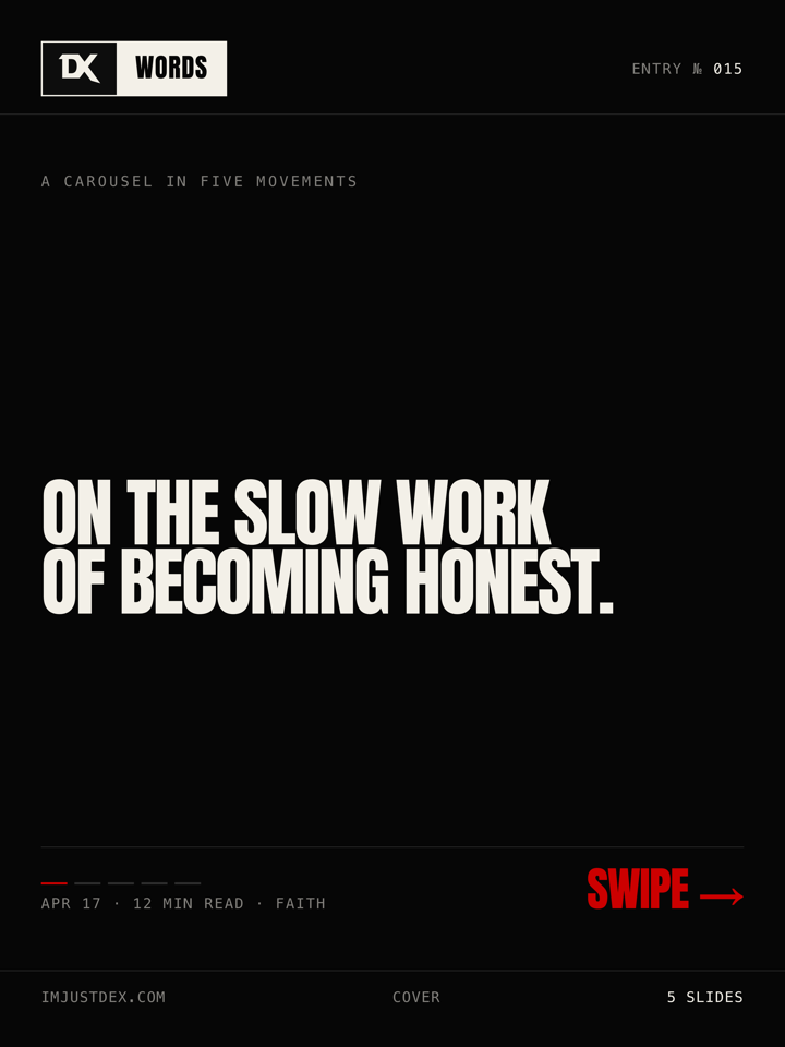
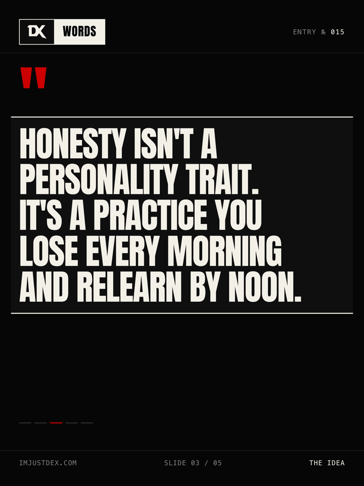
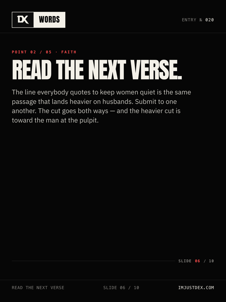
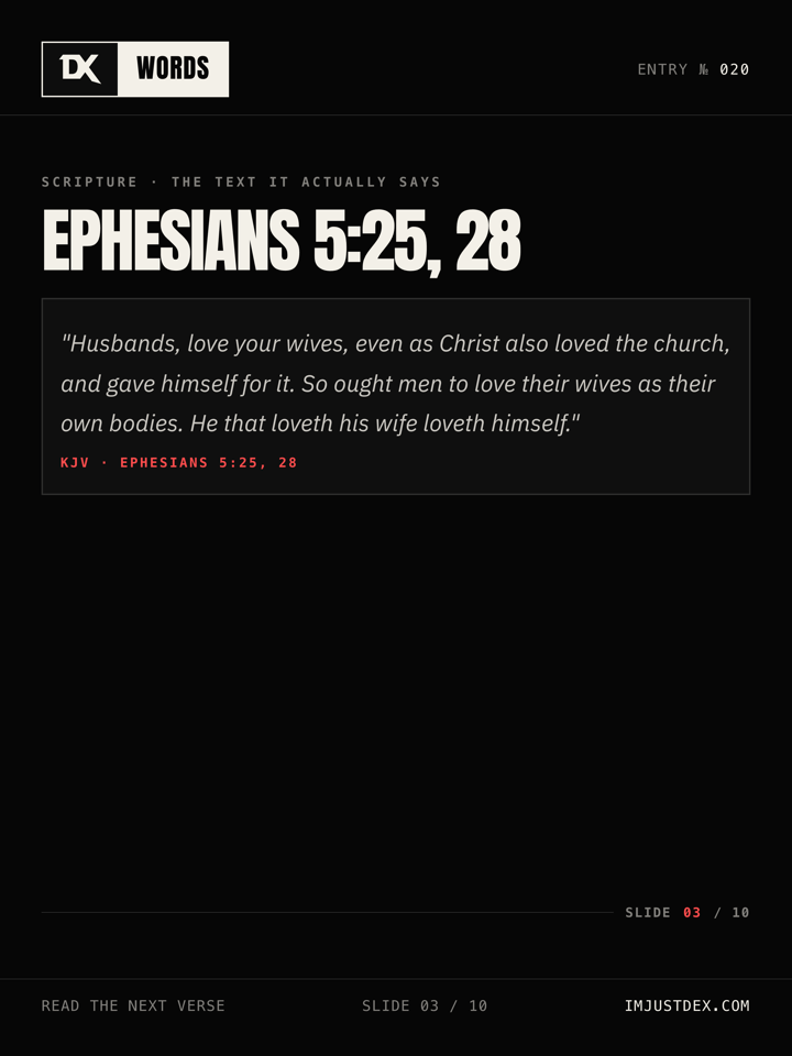

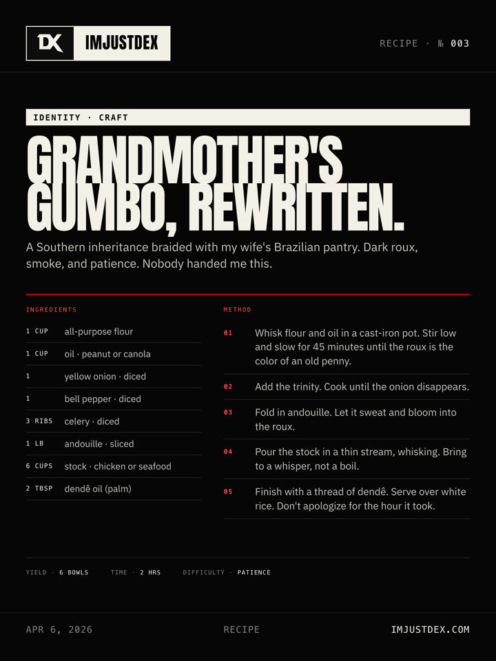
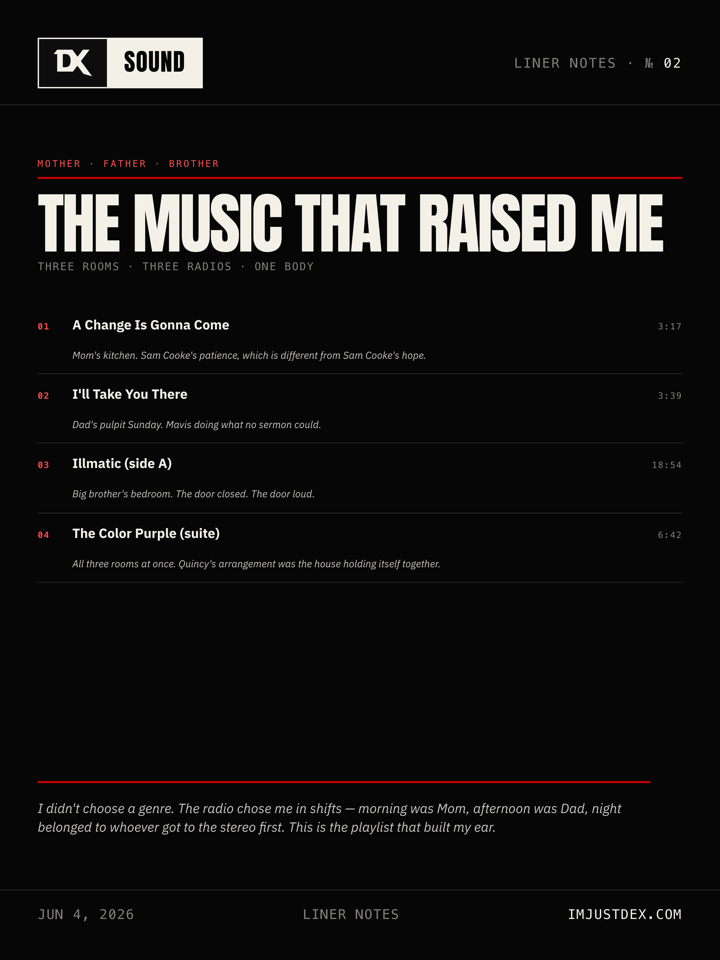
Five of the seven demos above are carousel slides. The full carousel vocabulary is ten slide types, selected per essay:
— DEX.Two affordances extend existing templates without forking; two more compose orthogonally with any template.
.note size + optional .pullquote slot with accent bar. For longer confessional memoir pieces that don't need a full template..verse-ref anchor + accent-bordered .reflection. For exegetical / doctrinal reckonings.Triduum · Day 2 / 3, Lenten · Day 12 / 40, Advent · Day 15 / 24, Anniversary · Year 1. Red accent dot + mono text. Any template can opt in.<sup class="fn-mark">1</sup> markers plus a <aside class="footnotes"><ol> at the bottom of .body. Composable with any template. Linter R8 normalizer strips footnote tags before comparing scripture text against the KJV corpus.Not an artboard template — a standalone HTML file pattern at project root, one per issue. imjustdex-issue-vol-<N>-no-<M>.html turns a cluster of essays into a discrete, citable volume: wordmark + issue index in the masthead, a hero pull-quote, and a numbered table of contents linking back to each essay. Fork the scaffold for each new issue. Makes the 14-essay calendar legible as sequential volumes to agents, editors, and archival readers.
Anton (self-hosted WOFF2). Impact / Haettenschweiler remain in the stack as system-native fallbacks. Uppercase, line-height 0.85–0.92, letter-spacing −0.03em. Scales per format: portrait 104px cover / story 144px / square 76px / landscape 52px.
IBM Plex Sans (self-hosted WOFF2, Regular / Bold / Italic). 24–25px, line-height 1.55–1.65. Color: rgba(243,240,232,0.82) dark, rgba(5,5,5,0.82) light. font-synthesis: none site-wide — no faux italics, no faux bold.
SF Mono / Fira Code / Cascadia Code / Courier New (system fallback stack, no loaded font). 11–14px, uppercase, letter-spacing 0.22em. Eyebrows, slide numbers, CTA pills, scripture citations.
Only 400 and 700. No 500, no 600. Anton ships at 400 only — weight 700 requests render at 400 (which is the only weight available). font-synthesis: none prevents faux-bolding.
--bg: #060606, --panel: #0d0d0d, --ink: #f3f0e8, --accent: #c00, --accent-on-dark: #ff4d4d. Default for carousel interior slides.
--bg: #f4f4f1, --panel: #f8f8f6, --ink: #050505, --accent: #c00. Common for announcement teasers and Now cards. Mix of light + dark is allowed across posts in a single campaign, never within one carousel.
#c00 identical in both modes for borders, fills, and display text ≥18px. Small red text (<18px) on dark mode flips to #ff4d4d (7.54:1 on #060606) via --accent-on-dark. Never backgrounds unless the whole surface is the accent.
SVG feTurbulence noise on slide-inner at 0.025 opacity, 128px tile. Adds print texture. Always present.
The default story format reserves 250/250 top/bottom — tuned for Instagram Stories. For other distribution targets, the system provides opt-in modifier classes applied at export time via --variant=. One campaign file supports every platform; no HTML duplication.
Every social template ships in four canonical formats. One campaign file, four dimensional variants, plus opt-in safe-zone modifiers for per-platform UI chrome. All inherit Refined Brutalism — grid, panel border, mono metadata, display headlines. Upload the matching format per destination.
Facebook Reels (needs ~670px bottom, not currently a variant), YouTube video thumbnails (1280×720 landscape adjacent), LinkedIn 1584×396 profile banner, full-bleed TikTok video thumbnail frames. Add as new dimensional classes or modifiers when a distribution channel commits.
The aesthetic is uncompromising. Accessibility is also uncompromising. These do not conflict. A system that cannot be read, navigated, or understood by all users is not disciplined — it is negligent.
All body text meets WCAG 2.1 AA minimum (4.5:1). --body-color at 0.82 opacity on --bg passes in both modes. --body-muted at 0.52 opacity is metadata-only and never used for essential content. --body-faint (0.18) and --body-tint (0.04) are decorative only — never carry meaning alone.
Body text: 16px minimum (1rem). Monospace metadata: 11px minimum (0.6875rem). No text on any surface smaller than 11px. Carousel body text: 24px minimum. Carousel monospace: 10px minimum at 1080px canvas width.
All interactive elements show a 2px solid var(--focus-ring) outline on :focus-visible with 2px offset. Never removed, never replaced with color-only indication. Tab order follows visual reading order. Skip-to-content link present on all pages.
Minimum 44×44px for all interactive elements. Mode toggle, navigation links, plate cards, share bar items, and tag links all meet this threshold. Padding counts toward target area.
All transitions and animations respect prefers-reduced-motion: reduce. When active: no hover transforms, no progress bar animation, no plate scale transitions. Static fallbacks only. The brand does not depend on motion for meaning.
Accent red never carries meaning alone. Every red element is also distinguished by position, border, weight, or label. Section heads have both red text and a red rule line. Scripture citations have both red color and italic styling. A monochrome printout of any page must remain fully legible.
Uppercase text-transform is restricted to monospace and display faces. Never applied to body reading copy. Letter-spacing on uppercase mono: 0.12em–0.25em maximum. Beyond 0.25em, words fragment and readability collapses. Display uppercase uses negative tracking (−0.03em) — never positive. Uppercase blocks must not exceed 3 lines without a line break or visual pause.
Minimum opacity for any text that carries meaning: 0.52 (--body-muted). Below 0.52 is decorative only and must never be the sole carrier of information. Ghost states (0.18) are visual texture — their content must also be accessible via screen reader or nearby visible text. --body-tint (0.04) is background shading only, never text. Disabled state floor: 0.32 opacity on the full element.
Every interactive element is reachable via Tab. Focus order matches visual reading order: masthead → mode toggle → content → footer. Visible focus outline on every tab stop. No focus traps. Skip-to-content link present on every page. Component-scoped bindings: when a surface introduces expandable components (accordions, disclosure panels) or grouped interactive controls (tag groups, meta rails used as filters), that component must bind Escape to collapse and arrow keys to roving focus within the group. These bindings live with the components that need them — the page itself is not responsible.
The system does not have a “mobile version.” It has one design that compresses. Components shed secondary elements at narrower widths but never change personality. The grid tightens. The borders remain.
≤ 768px: Plates stack single-column. Rulers hidden. Outer padding reduces to 18px. Grid background remains.
≤ 480px: Display type scales via clamp() floor values. Meta rail wraps. Share bar stacks vertically. Section indicator hides.
12-column at desktop. Single-column stack below 768px. Plates maintain 3px border and full texture treatment at all sizes. Plate titles use clamp() — never truncated, never hidden.
Max-width 680px at all breakpoints. Padding adjusts from 28px to 16px. Pull quotes, callouts, and scripture blocks remain full-width within the frame. No component is ever hidden on mobile.
All display type uses clamp() with a floor, preferred vw unit, and ceiling. Example: clamp(2.2rem, 6vw, 4.5rem). Headlines reflow naturally. Never truncated with ellipsis. Never reduced below the clamp floor.
Social templates are fixed-canvas per format (1080×1440 portrait, 1080×1920 story, 1080×1080 square, 1200×630 landscape). No responsive reflow within a format. Display type scales per format — story ∼35–50% up from portrait, square 25–35% down, landscape 50–65% down. Chrome (masthead, foot) auto-scales via dedicated .artboard.<format> selectors.
Landscape (1200×630) body auto-centers via .artboard.landscape .body { justify-content: center }. Multi-column blocks (Music Drop, Now Card) reflow to side-by-side grids for the horizontal real estate. Templates with explicit margin-top: auto anchors (carousel pagination) still push chrome to the frame edges because margin: auto beats justify-content in flex.
Body reading copy: 55–75 characters per line (optimal: 65). Enforced by max-width: 680px on the article frame. On mobile, line length compresses naturally but never below 40 characters at 16px body size. Monospace metadata has no line-length constraint — it is short by design.
Vertical spacing compresses but maintains proportional relationships. Section margins reduce from 48px to 32px. Component internal padding reduces from 24px to 16px. Grid gap stays at 12px. Border weights never change. The rhythm slows slightly on mobile — more breathing room between components, not less. Monospace labels below 11px on mobile: remove letter-spacing reduction, maintain 0.12em minimum.
Texture background plates (concrete, noise, lines) crop center on all breakpoints. Never stretch. Never reveal edges. Title overlay stays bottom-left. Meta tag stays bottom-right. If the plate aspect ratio changes (e.g., square post vs. carousel), re-center the texture and re-anchor text to the bottom third.
Below 480px: share bar items stack vertically. Section indicator hides (content is short enough to not need it). Tag pills wrap to second line if needed — never hidden. Read time always visible. “Coming Soon” badge always visible. If a component must be removed for space, remove decorative elements first (rulers, section indicator), never structural ones (tags, meta, borders).
overflow-x: clip lives on html (not just body) — iOS Safari requires it on the root to prevent horizontal scroll from off-page descendants. The .page-shell uses overflow-x: clip as defense-in-depth. clip is used instead of hidden so the sticky masthead keeps working.
Motion is mechanical, not expressive. Every transition is short, linear or ease-out, and serves a single purpose: confirm that an interaction registered. The brand does not bounce, spring, wobble, or delight. It responds.
Motion is tokenized as a three-rung duration scale composed with a single easing curve. --motion-fast (120ms) for hover chrome, progress bar fills. --motion-med (180ms) for the body mode flip and small-chrome opacity. --motion-slow (300ms) for ambient reveals like the section indicator. --ease-default (cubic-bezier(.2, .8, .2, 1)) is the one curve; linear stays linear where the motion tracks a continuous value. If a duration isn’t in this scale, it doesn’t belong in the product. Never ease-in-out. Never overshoot curves. Never transitions longer than --motion-slow.
Plates: border-color shifts to var(--accent), subtle scale(1.005) transform. Links: underline appears via border-bottom, color unchanged. Tags/Meta: background shifts to var(--body-tint). Buttons: background and foreground invert.
Scale to 0.98 on interactive elements. Immediate — no transition on press, only on release. Color does not change on active. The press is the only feedback.
:focus-visible shows 2px solid var(--accent) outline, 2px offset. Selected/current states (active tag, current section) use var(--ink) background with var(--bg) text — full inversion. Never a partial highlight.
Disabled elements: 0.32 opacity, cursor: not-allowed, no hover effect. Empty states (no articles, no results): centered monospace text, uppercase, var(--body-muted) color. Never illustrated. Never friendly. Example: “Nothing here yet.”
Reading progress bar: var(--ink) fill, 3px height, linear left-to-right. Red was pulled from the progress bar because a red strip at the viewport top was competing with the masthead and diluting the accent’s semantic weight. Red is reserved for section heads, callouts, underlines, and focus rings — never for ambient chrome. Page loads: no skeleton screens, no spinners. Content appears when ready. If a delay exceeds 2s, a single monospace status line appears: “Loading.” — no animation, no ellipsis cycle.
Expandable content uses native <details>/<summary> (see Study Note). Toggle state is exposed via [open] attribute selectors — no ARIA polyfill required; the element is natively accessible. Transition: --motion-med on the ::after indicator rotation. No height animation (content reflow is instant) — no bounce, no spring.
Error states use var(--accent) red — the system already reserves red for emphasis, so errors inherit the same signal. Error text: monospace, uppercase, var(--accent) color. Error borders: 2px solid var(--accent) on the affected field. No icons. No exclamation marks. No friendly language. Example: “Required.” or “Invalid format.”
Visited article links on homepage plates: no color change. The system does not differentiate visited from unvisited. The read/unread distinction is not part of the editorial posture. If tracking is needed, it happens in metadata (“Read” tag), not in link styling.
The masthead of the editorial issue. Sits directly under the site chrome on the homepage. Carries the issue number, the week stamp, and a “latest” standfirst that deep-links to the current essay. Modeled on newspaper front-matter — the reader knows which edition they landed on before they read a word.
Rules. Issue number increments only with a new lead essay. Week stamp is always the publication week, not the current week. The standfirst block is the only place an essay link coexists with editorial metadata above the archive — everything else lives on the plates.
The author block. Split main/side layout — the name on one side at display scale, a short bio + two actions on the other. Never more than two actions. Primary action links to the full about page; secondary anchors the subscribe manifesto.
Hard rules. One identity hero per site. Never on article pages. Never duplicated on social. The name is always “Dexter Jakes” — no first-name-only, no handle-as-name. The corner eyebrow is the edition marker (“The Writer → 01”) and maps to issue numbering.
No highlight reel. Just the full human, documented.
About — Est. 2026
Someone working the line between faith, art, and identity. Essays here are the long form — slow paragraphs, no hot takes, no calls to action.
A three-cell classification rail. Each cell is a filter trigger — click “Faith” and the archive hides every plate not on that lane. The third cell is the queued state: a lane with no essays yet, rendered dashed and non-interactive. The cell stays visible so the taxonomy is always legible, even when a lane is empty.
Rules. Three lanes max: Faith, Identity, Art. No sub-lanes. No badges. Click toggles aria-pressed on the button and adds a filter class to the archive root. One lane active at a time; clicking the active lane resets to “all.” Queued cells carry aria-disabled="true" and a descriptive aria-label.
The issue opener. A two-column plate that splits a textured image (with latest-badge overlay) against an editorial body panel (eyebrow, title, deck, rail). This is the only plate variant that carries a deck — every other plate is title + meta. Used exactly once per issue.
.plate-row is an archive-density modifier. Drops a .plate-secondary card into a single-row layout so the title, deck, and meta sit inline. Use at the bottom of the archive for older entries where scale-parity with newer plates would be visual noise.
On the Sunday school lie that split sacred from secular, the Psalms that broke it, and the song that met me when I couldn’t pray.
A year after a loss — grief and gratitude in the same breath, and refusing the tidy ending.
The subscribe block. A two-column split — ink-saturated title wall on the left (4-line stack, one word in the accent ink slot), receipt-style checklist and email capture on the right. Anti-pattern for every other subscribe block on the web: no hero image, no urgency copy, no social proof, no testimonials. The promise is the design.
Rules. One per site. Always at the bottom of the homepage. The title is fixed at four lines — rewording is allowed, restructuring is not. The form action on production points at /api/subscribe (Netlify function, Mailchimp REST v3). The demo below is inert — no submission endpoint, no form action. Previewing markup only.
An essay, a resource, a research note — whatever earns its way in.
The teaser strip. A single-line announcement for the next essay in the queue — title, lane, estimated drop date, read time, and a “notify me” affordance that anchors back to the subscribe manifesto. Sits between the archive and the subscribe block. Disappears the moment the next essay publishes and is replaced by the next-next.
Rules. One per homepage. Dated in absolute format (“Apr 23”) — never “Next week” or relative. Never includes a deck. If a drop date is uncertain, the strip is hidden — do not publish “TBD.”
Collapsible footnotes surfacing translation, historical, or cross-reference context beneath a scripture block. Native <details>/<summary> — no JavaScript, no ARIA polyfill, keyboard-accessible by default. Closed at first paint. The trigger carries the reference and a mono label; the body carries the actual note, sources, and cross-references.
Rules. Only on scripture-backed essays (currently all nine). Always appears directly under the scripture block it annotates. Never used for author commentary on the main argument — that belongs in the body. Include at least one source citation per note. Use sparingly: if every scripture block has a note, the reader is being trained to ignore them.
Markup. <details class="study-note"> → <summary class="study-note-trigger"> with .study-note-label, .study-note-ref, and .study-note-toggle → .study-note-body containing the note plus optional .study-note-sources and .study-note-cross rails. Full CSS lives in article.css.
Paul’s phrase in Romans 8:26 — stenagmois alālētois — is usually rendered “groanings which cannot be uttered.” Stenagmos is the deep, involuntary groan of the body under compression (the word is used of a siege wall about to collapse). Alālētos is the negation of articulate speech — not wordless, but prior to words. The text is saying the Spirit prays the groan itself, not a translation of it. Commentary: Dunn (1988), Moo (1996), Jewett (2007). See also Psalm 6:6, where the same body-in-grief posture is set to song.